Corporate style for Belaruski Čas newspaper
Quoting, professionalism and commitment to the style of a modern European newspaper
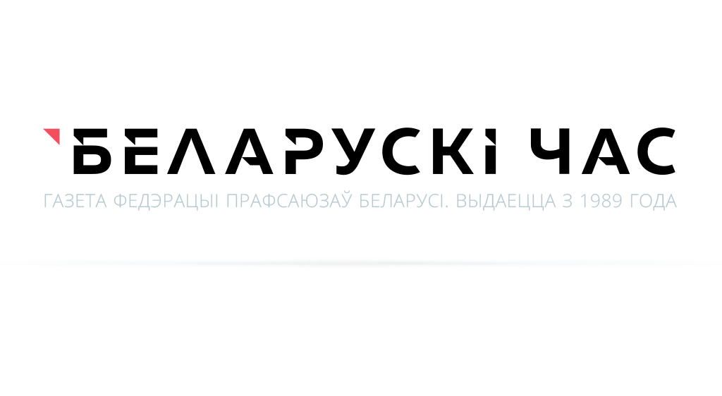
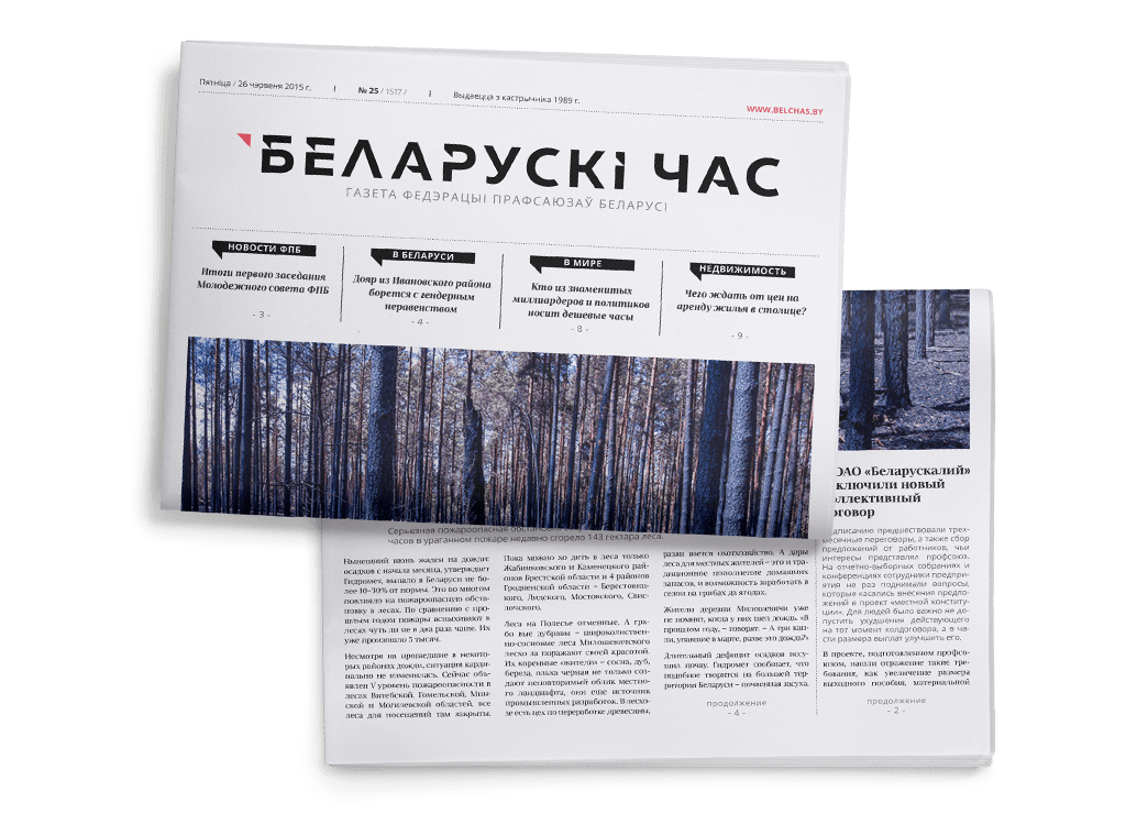
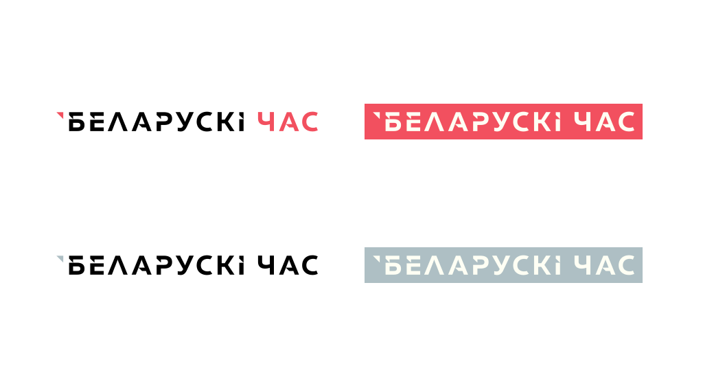
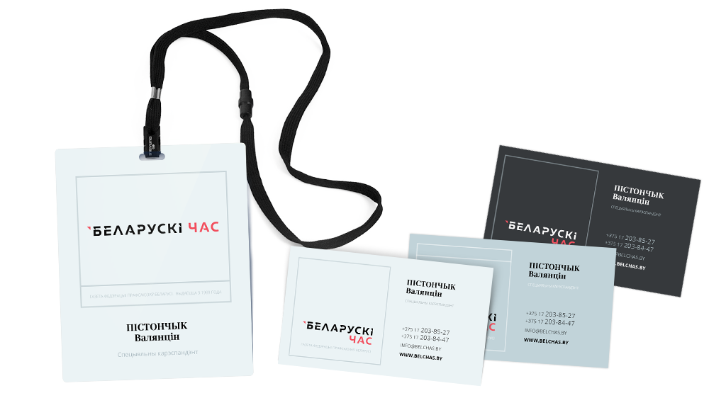
We started creating the new appearance of Belaruski Čas newspaper, whose website we had already developed, from the logo and the corporate style. We tried to focus on the authority of the periodical among the target audience – it is quoted, it is referred to. The style of the logo is to visualize such concepts as mobility, pithiness and accuracy. The colours correspond to the corporate colours; although the basic colour is not red but black which is traditionally associated with nobleness and confidence by readers who tend to trust such materials.
The triangle used as the basis for developing the logo and the special font is directly related to the idea of quoting – it is worth mentioning similar elements and their functions in Excel or Google.Docs.
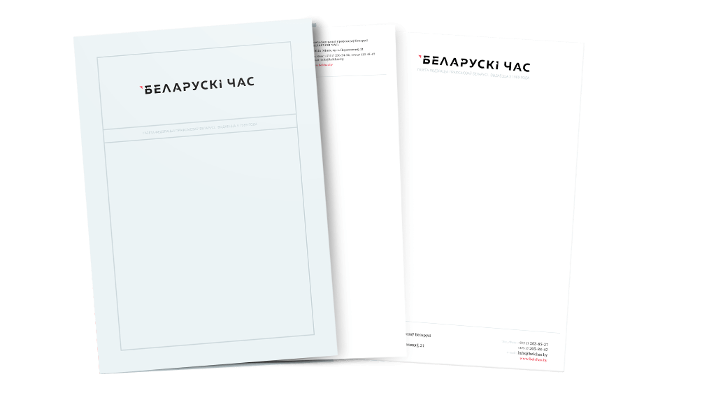
Because of the target audience, the style is based on the modesty and distinctiveness of shapes which supports the newspaper’s image of a serious and high-quality periodical on the associational level. Each element of the corporate polygraphy has to support this idea. The elegant design once again proves that the newspaper is a periodical which publishes noteworthy news based on facts from trustworthy sources.
Thus, the identity helps to create the image of a periodical with objective, sound and topical materials. This means, they have to be quoted both in our country and abroad.