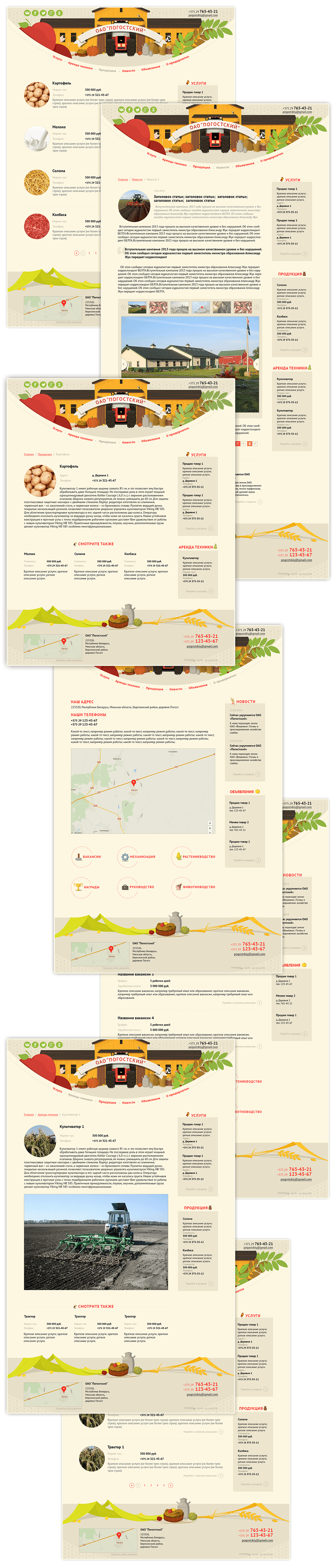
Website design for JSC Pahostski
Bright fruit colours and pleasant vegetable shapes in website design for JSC Pahostski
JSC Pahostski is an agricultural enterprise in Bierazino district of Minsk region with the total of over 8,250 ha of farm land, including over 5,700 ha of plough land. The enterprise focuses on growing grain crops, potatoes and rape as well as meat and milk producing animals. This year, JSC Pahostski has expanded its territory and has decided to increase the amount of export. The new website which was designed in the studio was to contain export offers with detailed descriptions and to find potential customers.
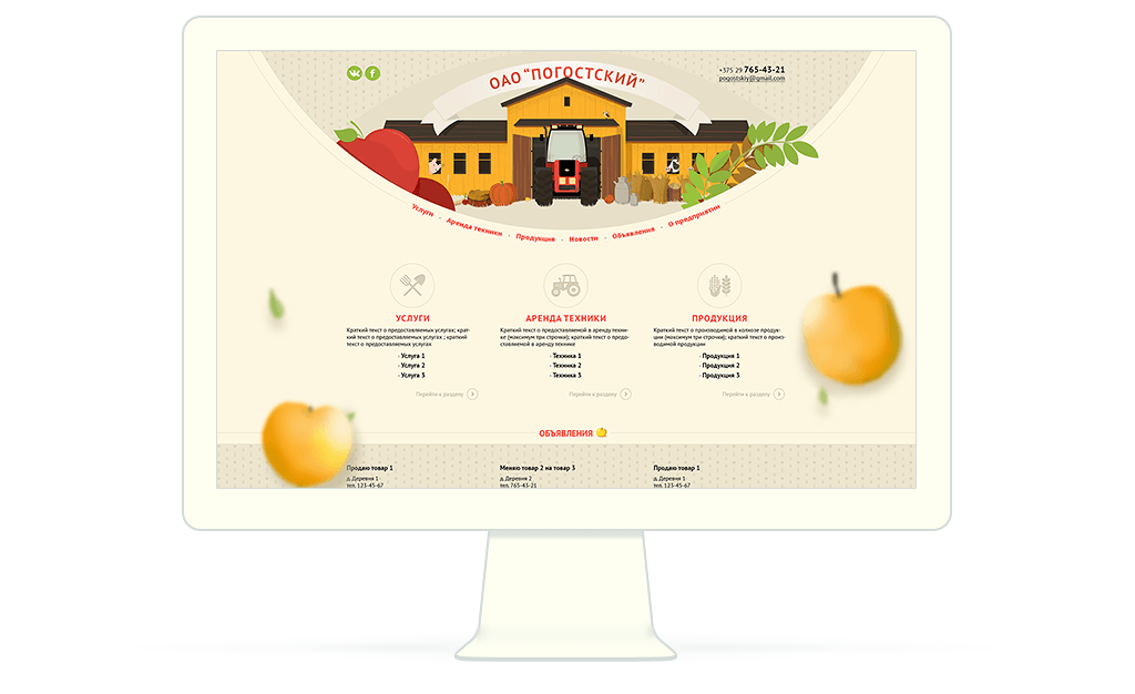
The main colours of the website are the colours of grain, soil and sun and place an additional emphasis on the website’s subject matter
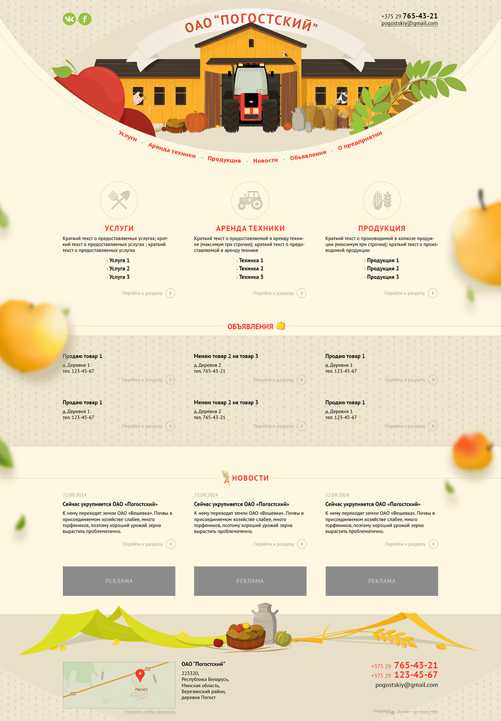
As the enterprise had no logo and corporate style and the client wanted to avoid photos and at the same time to reflect the joyful and peaceful life style of the JSC, the cheerful PRAS team suggested drawing the pages with the elements of production, the main export potential of JSC Pahostski. The header of the website helps to familiarize the user with pastoral scenes and details/icons/animation designed in the same style help this visual effect to last as long as possible. The round design forms coincide with the round apples and potatoes and the warm colours remind of yielding summer days. The studio created the templates and the design whereas the layout and programming were ensured by the enterprise itself. Enjoy your meal!