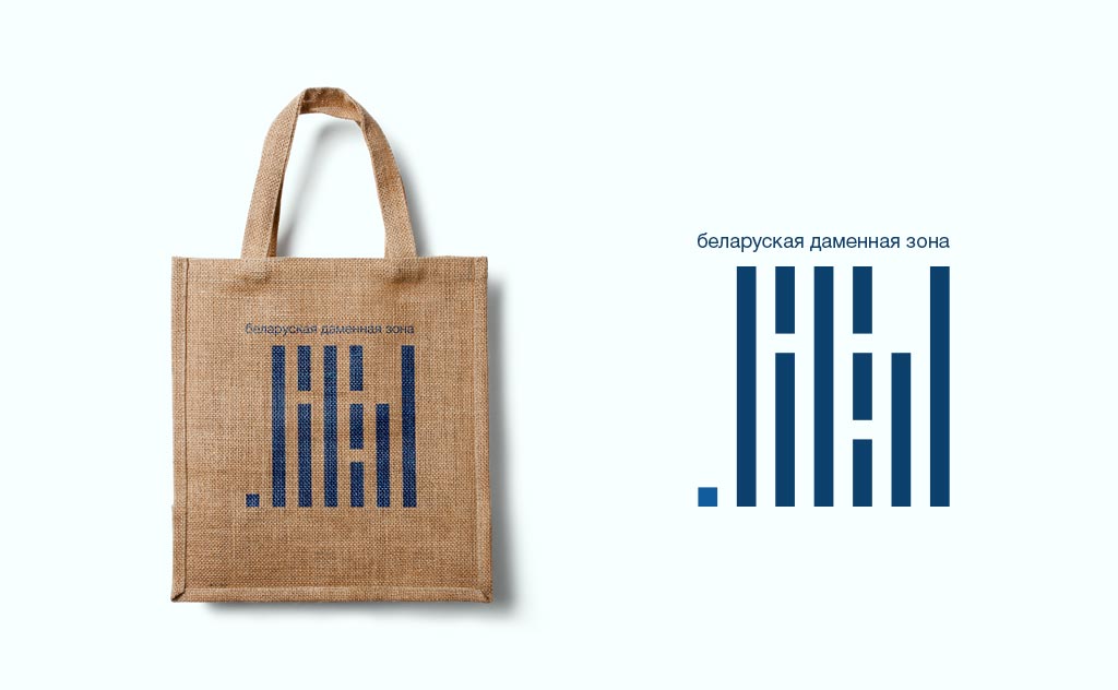
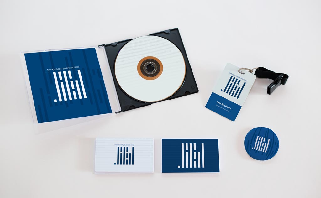
Logo for .БЕЛ domain
The logo suggested by Aliaksiej Kuĺbicki became one of the tree official logos of the Cyrillic .БЕЛ domain
We have promptly developed and calmly took the third place in the contest to choose the logo of the new.БЕЛ domain. Although we believe that Cyrillic domains are not necessary, we simply couldn’t but took part in creating trends in the area of significant IT-related initiatives. We started designing the logo from filtering our competitors: what would 90% of the participants suggest? — You are right! The Belarusian star-cornflower =)
We thought that for almost 30 last years Belarus had been a country of technologies and the ancestors of modern systems, punched cards, had to be used as the basis.
Why punch cards? It is known that in the 1960s –1970s, Belarusian programmers to some extent were considered leaders in the USSR. This is proved not only by success in development but also by series of data-processing machines called “Minsk”. At that time punch cards were peculiar to programming and they allegedly became ancestors of today’s code. Therefore, the .БЕЛ domain was inspired by the image of a punch card — this is to pay respect to our developers and a successful metaphor which reflects the history and development of the domestic IT-sphere.
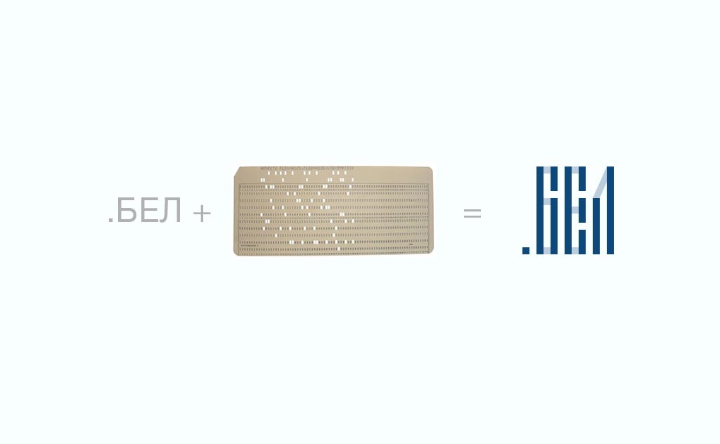
Don’t you see the word .БЕЛ in the logo?.. Move a bit away from the screen
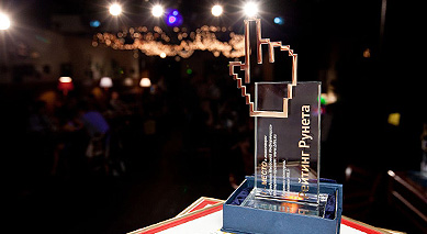
To Belarusian ad makers’ credit, they did not consider the idea of art studio PRAS completely crazy: we were awarded the third place and the dinner in a restaurant. To our joy, comments in social networks and in Belarusian media showed the highest level of interest (although sometimes combined with non-acceptance) in the logo suggested by us – isn’t it the best award?