Corporate style for “Country of Cmoks”
We have developed the corporate style for the “Country of Cmoks” (“Country of Dragons”) project launched by Budzma initiative.
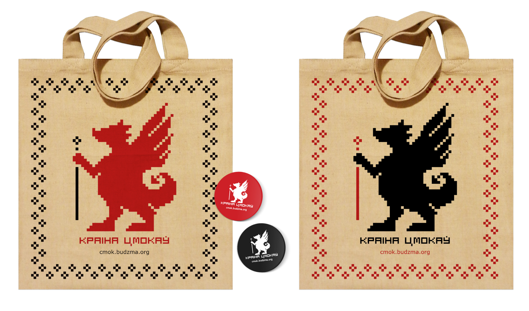
The objective was to create a distinct image of a Belarusian cmok (dragon) using the old logo as a basis, which would match the corporate style of Budzma campaign. The customer's corporate style is based on the pixel-like Belarusian ornament. Apart from that, according to legends, unlike their overseas peers, Belarusian cmoks were kind. Cmoks did not steal gold and helped best people to find it. We bore this in mind when we started working on the logo of the “Country of Cmoks” campaign.
We decided to use the mysterious and symbolic Belarusian ornament as an example.

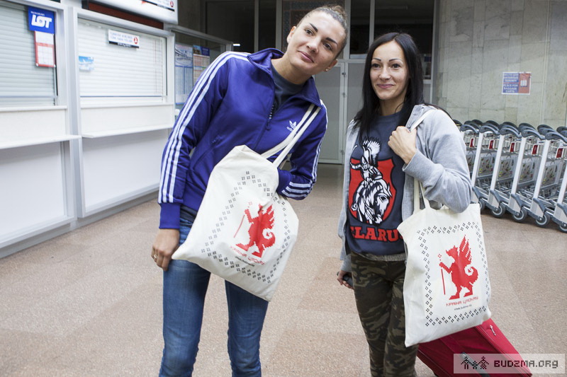
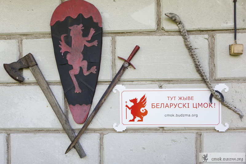
Apart from the logo, the corporate font for the “Country of Cmoks” project has been created. The font matches the logo and Budzma’s corporate style. Two main colours of the national embroidery (black and red ones) have been used for bags. The sign board will be used in places where Belarusian cmoks could have lived according to the authors of the project. There are several dozens of such places in the country. Therefore, our sign boards will be seen by tourists for a long time.
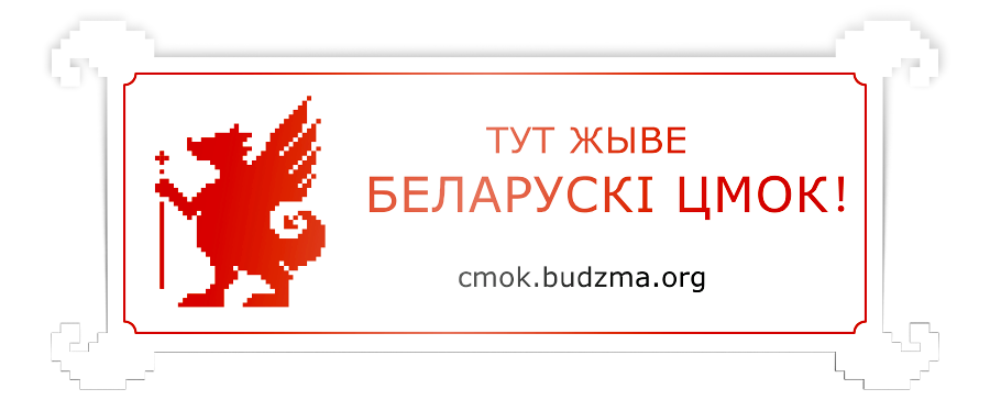
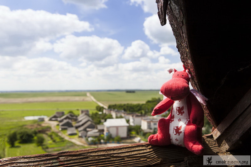
Below you can see how Budzma campaign uses the brand developed by us. Photos by Aliaksandr Ždanovič