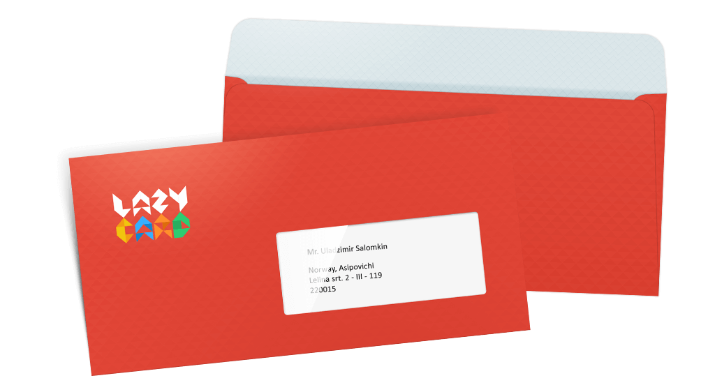
Corporate style for LazyCard
Design for the heartwarming mobile app
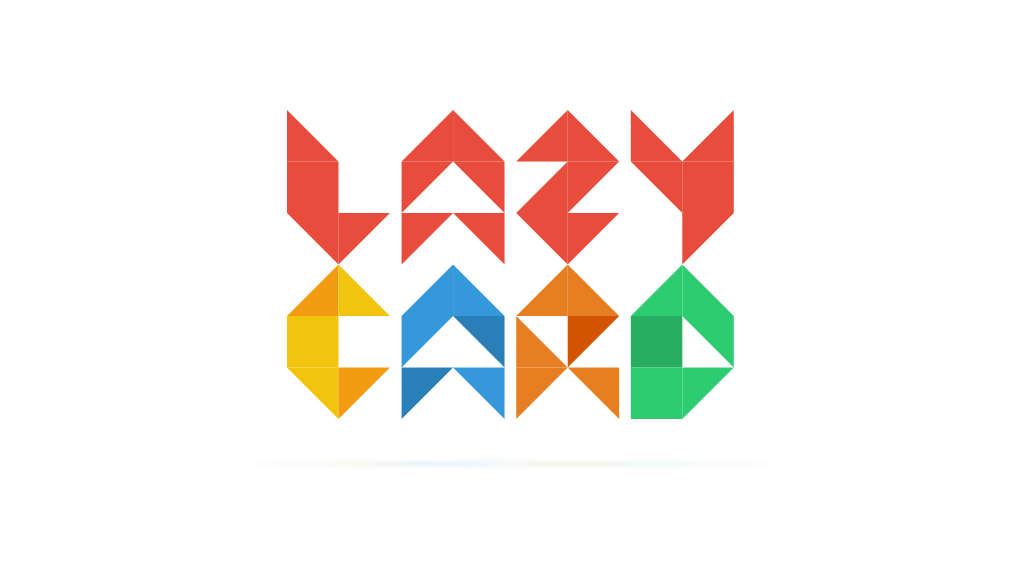
Some time ago we created Lazy Card application which unites the two worlds – the world of digital photos and paper post cards. We made the idea which was good in all senses even better due to the bright style of the project. The logo consists of multi-coloured “paper” letters.
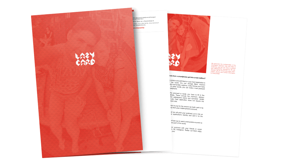
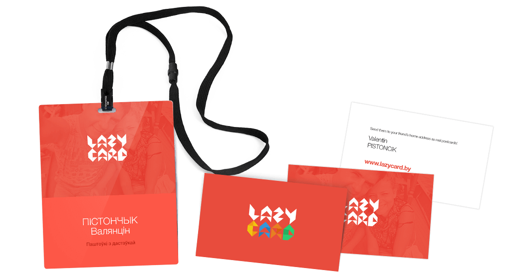
As for the corporate printed materials, the logo is bright white – folders, letterheads, badges and business cards are to ensure a decent presentation for the project. To support the general mood of the application, we used happy selfies of active app users in the background.
Any user starts anticipating how his or her friends will get impressions from the screen in the form of a live postcard the moment he or she downloads the application.
The bright envelope is probably the most important thing. British scientists have proved that Lazy Card addressees start smiling before they see the content with postcards. Isn’t it the main benefit of the mobile application? :)
